Elements of Art
The common language of artists
Elements of Art
Color
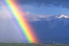
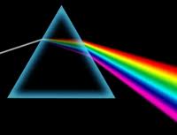
You see color everywhere. Color is a part of your life. When you go anywhere, the roads and streets are lined with color. You enter stores filled with color. Anything you buy has color. If you open a box of crayons, felt markers, or pencil crayons, you see a rainbow of colors. You have probably seen a rainbow (or two) in the sky after a rainfall. A rainbow in the sky is the result of light that is split by droplets of water, which act like prisms. If you find a glass crystal at home and place it in a sunbeam, you will see how the prism (the crystal) splits light into many colors.

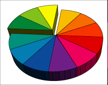
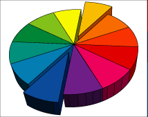
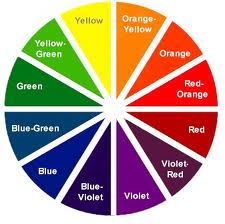 You will notice that the color wheel has the same progression of colors as in the spectrum, but they are bent into a circle. The colors on the color wheel are divided into the following three categories primary colors, secondary colors, and intermediate colors. The primary colors are spaced apart equally on the wheel. The three secondary colors are placed between the primary colors from which they are mixed. An intermediate color is placed between each primary and each secondary color (from which it is mixed), thereby resulting in a twelve-color wheel.
Color has three properties. These properties are often referred to as the dimensions, qualities, or characteristics of color. They include the following:
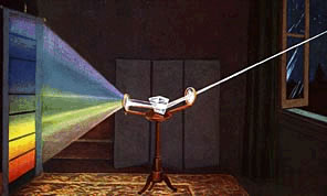 Hue is the name of the color. It indicates the color’s position in the spectrum and is referred to as the color name. You may be wondering why red is at one end of the spectrum and violet at the opposite end. Each color has a specific wavelength, placing it in its proper sequence in the spectrum. Red has the longest wavelength; violet has the shortest wavelength. A color may change its hue by being mixed with another color. By mixing colors, you are changing their wavelengths. You have already studied how to make secondary and intermediate colors.
Value:
Intensity:
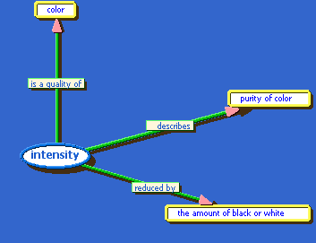
Intensity refers to the brightness or dullness of the color. It refers to the quality of light in a color. Dull colors are less exciting and cheerful than bright colors. For exciting cheerful effects, use bright colors. For calming and/or sad effects, use dull colors.
Artists have worked for years with certain color combinations called color harmonies or schemes.
Some color harmonies or schemes designers can work with include the following:
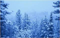
A picture based on green might include colors like lime, sage, kelly, emerald, forest, mint, and avocado green. Using just one color in different variations makes a person appreciate all the possibilities there are to choose from.
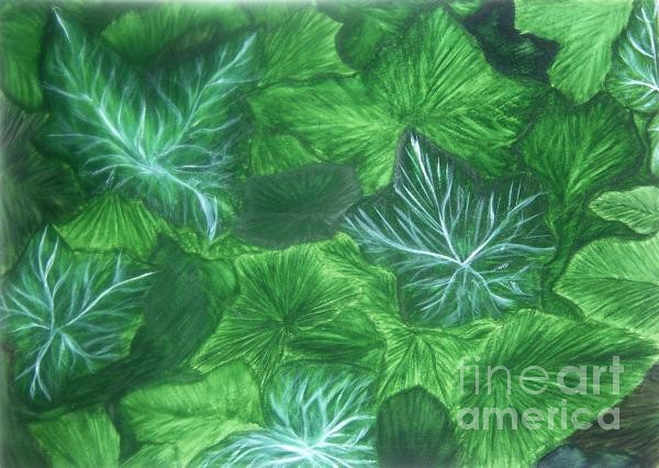
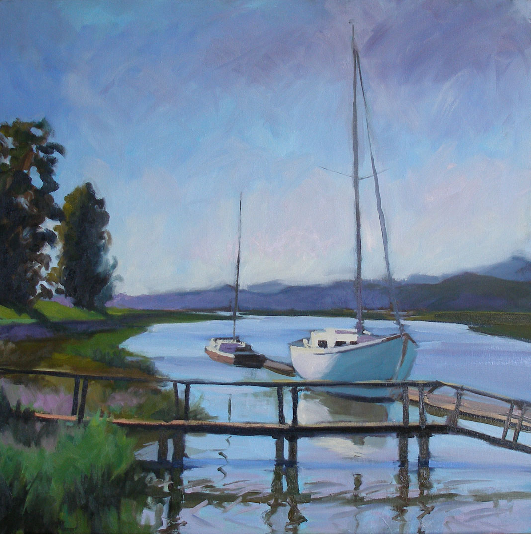
 Think of analogous colors as cousins in your family. Analogous colors are related to or close to each other on the color wheel. For instance, green is an analogous color to yellow. The color between green and yellow, yellow green, is analogous to green and yellow. The color between blue and violet, blue violet, is analogous to blue and violet. Analogous colors placed together look restful because there are no strong contrasts. When you want a peaceful-looking picture, you can use mostly analogous colors. For example, picture a bright, sunny, summer day with a blue sky and green grass. The picture looks peaceful because blue and green are analogous colors.
 Complementary colors can be found using the color wheel. Place your finger on any color on the color wheel. Look for a color opposite the one you have picked. For example, find blue. Look directly across the color wheel and you will find orange, which is the complementary color to blue. Violet and yellow are complementary colors. Red and green are complementary colors, too.
What purpose do complementary colors have? They are especially useful if you want to mix a duller color that has more intensity and interest than a color that simply has black mixed into it. Colors have more intensity if they are mixed without black. To alter the intensity of a color, you can add the same color or mix a complementary color (colors across from each other on the color wheel) with the original color. For example, to change the intensity of yellow, add more yellow or violet (yellow’s complementary color). To change the intensity of orange, add more orange or blue (orange’s complementary color). To change the intensity of green, add more green or red (green’s complementary color).
Complementary colors can make your designs look more exciting. For excitement use complementary colors side by side. Orange and blue, for instance, seen side by side are exciting because they are complementary colors; they are opposite each other on the color wheel. The blue put beside orange makes orange look more orange and the blue more blue.

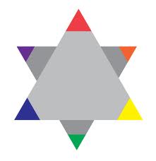 Still another color combination artists find interesting to work with is the triad color harmony. A triad means “three”; therefore, a triad color harmony means three colors. These three colors are spaced equally on the color wheel. Red, blue, and yellow is a triad color harmony. The most effective triadic color scheme consists of the three primary colors. The extreme contrast among these three colors has immense visual impact. You can create other triadic color schemes with secondary and tertiary colors although, in general, these triads are much more difficult to work with than the primary triad because the contrast between the colors tends to be somewhat less powerful
Triadic color schemes have the advantage of being extremely stable because each color balances perfectly with the other two colors. The bold nature of the colors involved makes the triadic color scheme vibrant and useful for presenting information in bold, decisive patterns. At times, however, this vibrancy may make triadic color schemes too garish and unsettling to convey information successfully.


 You will notice that the color wheel has the same progression of colors as in the spectrum, but they are bent into a circle. The colors on the color wheel are divided into the following three categories primary colors, secondary colors, and intermediate colors. The primary colors are spaced apart equally on the wheel. The three secondary colors are placed between the primary colors from which they are mixed. An intermediate color is placed between each primary and each secondary color (from which it is mixed), thereby resulting in a twelve-color wheel.
|
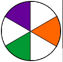
The primary colors are red, blue, and yellow. They are called primary because they cannot be produced by mixing other colors. Other colors can be mixed using these primary colors. |
 |
The secondary colors are green, violet, and orange. Each stands midway between two primary colors. Orange is equidistant from red and yellow, green from yellow and blue, and violet from blue and red. A secondary color is made by mixing two primary colors. When you mix red and yellow, you get orange; when you mix yellow and blue, you get green; when you mix blue and red, you get violet. |
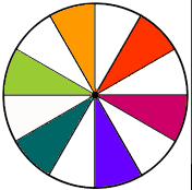 |
Think of an intermediate color as something in the middle. Intermediate colors stand midway between a primary color and a secondary color. For example, yellow green is between the primary color yellow and the secondary color green. The intermediate color results when the neighboring primary and secondary colors mix. Yellow green results from mixing yellow and green |
Color has three properties. These properties are often referred to as the dimensions, qualities, or characteristics of color. They include the following:
- hue
- value
- intensity
 Hue is the name of the color. It indicates the color’s position in the spectrum and is referred to as the color name. You may be wondering why red is at one end of the spectrum and violet at the opposite end. Each color has a specific wavelength, placing it in its proper sequence in the spectrum. Red has the longest wavelength; violet has the shortest wavelength. A color may change its hue by being mixed with another color. By mixing colors, you are changing their wavelengths. You have already studied how to make secondary and intermediate colors.
Value:
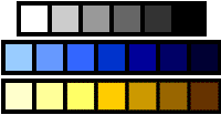 |
Value describes the lightness or darkness of a color. White is the lightest value and black the darkest. |
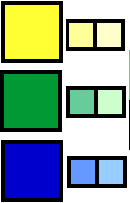 |
Adding white to a color produces a tint, which is a lighter version of the color. For example, pink is a tint of red; it is made by adding white to red. (Notice the three tint examples - a dab of white paint has been added to each of the colors.) |
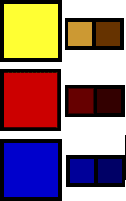 |
Adding black to a color produces a shade, which is a darker version of the color. For example, adding black to red produces a maroon color. Adding gray to a color produces a tone. |
Intensity:
Intensity refers to the brightness or dullness of the color. It refers to the quality of light in a color. Dull colors are less exciting and cheerful than bright colors. For exciting cheerful effects, use bright colors. For calming and/or sad effects, use dull colors.

Artists have worked for years with certain color combinations called color harmonies or schemes.
Some color harmonies or schemes designers can work with include the following:
- monochromatic
- analogous
- complementary
- triad


 Think of analogous colors as cousins in your family. Analogous colors are related to or close to each other on the color wheel. For instance, green is an analogous color to yellow. The color between green and yellow, yellow green, is analogous to green and yellow. The color between blue and violet, blue violet, is analogous to blue and violet. Analogous colors placed together look restful because there are no strong contrasts. When you want a peaceful-looking picture, you can use mostly analogous colors. For example, picture a bright, sunny, summer day with a blue sky and green grass. The picture looks peaceful because blue and green are analogous colors.
 Complementary colors can be found using the color wheel. Place your finger on any color on the color wheel. Look for a color opposite the one you have picked. For example, find blue. Look directly across the color wheel and you will find orange, which is the complementary color to blue. Violet and yellow are complementary colors. Red and green are complementary colors, too.
What purpose do complementary colors have? They are especially useful if you want to mix a duller color that has more intensity and interest than a color that simply has black mixed into it. Colors have more intensity if they are mixed without black. To alter the intensity of a color, you can add the same color or mix a complementary color (colors across from each other on the color wheel) with the original color. For example, to change the intensity of yellow, add more yellow or violet (yellow’s complementary color). To change the intensity of orange, add more orange or blue (orange’s complementary color). To change the intensity of green, add more green or red (green’s complementary color).
Complementary colors can make your designs look more exciting. For excitement use complementary colors side by side. Orange and blue, for instance, seen side by side are exciting because they are complementary colors; they are opposite each other on the color wheel. The blue put beside orange makes orange look more orange and the blue more blue.

 Still another color combination artists find interesting to work with is the triad color harmony. A triad means “three”; therefore, a triad color harmony means three colors. These three colors are spaced equally on the color wheel. Red, blue, and yellow is a triad color harmony. The most effective triadic color scheme consists of the three primary colors. The extreme contrast among these three colors has immense visual impact. You can create other triadic color schemes with secondary and tertiary colors although, in general, these triads are much more difficult to work with than the primary triad because the contrast between the colors tends to be somewhat less powerful
Triadic color schemes have the advantage of being extremely stable because each color balances perfectly with the other two colors. The bold nature of the colors involved makes the triadic color scheme vibrant and useful for presenting information in bold, decisive patterns. At times, however, this vibrancy may make triadic color schemes too garish and unsettling to convey information successfully.

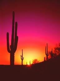
Why are some colors called warm and some called cool? If you think of a dry, blazing desert where the sand is so hot it burns your feet, you might see red, orange, and yellow, because red and orange are fire colors and fire is hot to the touch. You would also use these colors to show crowds, activity, and tension. They are good to use for happy pictures.
Green, blue, or violet colors make people think of shady spots, cool streams, and mountains. These colors suggest peace and quietness. Dull, cool colors are also good for a sad picture.

Projecting and Receding Colors
You can use colors to make shapes and areas on a flat surface seem closer to you or farther away from you. Bright (very intense) colors project or seem to come forward. Dull colors have a low intensity—they recede or seem to go away. The intense blue of a peacock’s feathers, for instance, will project more than the dull blue of faded denim.
A color’s value can make it project or recede. Colors that are lighter and brighter will project. Colors that are darker and duller will recede.
Warm colors project. Cool colors recede. Light, intense orange will project more than light, intense green, for instance. Knowing that bright, light, and warm colors project and dull, dark, and cool colors recede will help you make shapes and spaces project or recede in your designs.
Since bright, warm colors seem to come forward, they are good colors for important things and people in the pictures you design.
Since cool colors seem to withdraw or recede, they are good colors for less important things and less important people and for background areas like walls.
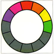 The hues of magenta, red, orange, yellow, and yellow-green are generally referred to as the warm colors. These colors produce a synaesthetic experience of heat in most viewers. Studies have been conducted in which test subjects were placed in rooms painted in a warm color and their perceptions of the room's temperature was almost always much warmer than its actual temperature. The warmth that these colors radiate tends to make them seem warm, cozy, and inviting and they draw attention very easily. Psychologically warm colors are associated with happiness and comfort. Completely warm color schemes have the advantage of being pleasantly inviting and inherently harmonious. Warm color schemes with no variety, however, have the disadvantage of being tremendously dull with no inherent eye-catching color combinations.
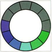 The hues of violet, blue, light blue, cyan, and sea green are generally referred to as the cool colors. As with the warm colors, the cool colors can shift your perception of temperature although they tend to make you feel colder instead of warmer. Compositions that use the cool colors often seem slick and professional, but the coldness these colors radiate often turns people off. Psychologically, cool colors are associated with sadness, depression, and melancholia.
Completely cool color schemes have the advantage of being extremely harmonious and professional-looking. Just as with warm color schemes, however, cold color schemes with no variety are often dull.
There are two colors not classified as warm or cool: purple and pure green. These two colors don't fit easily into the cold/ warm classification. They seem to take on properties of warmth or coolness based on the context in which they've been placed. Use these two colors with great care in your warm and cool compositions.
Green, blue, or violet colors make people think of shady spots, cool streams, and mountains. These colors suggest peace and quietness. Dull, cool colors are also good for a sad picture.


Projecting and Receding Colors
You can use colors to make shapes and areas on a flat surface seem closer to you or farther away from you. Bright (very intense) colors project or seem to come forward. Dull colors have a low intensity—they recede or seem to go away. The intense blue of a peacock’s feathers, for instance, will project more than the dull blue of faded denim.
A color’s value can make it project or recede. Colors that are lighter and brighter will project. Colors that are darker and duller will recede.
Warm colors project. Cool colors recede. Light, intense orange will project more than light, intense green, for instance. Knowing that bright, light, and warm colors project and dull, dark, and cool colors recede will help you make shapes and spaces project or recede in your designs.
Since bright, warm colors seem to come forward, they are good colors for important things and people in the pictures you design.
Since cool colors seem to withdraw or recede, they are good colors for less important things and less important people and for background areas like walls.
 The hues of magenta, red, orange, yellow, and yellow-green are generally referred to as the warm colors. These colors produce a synaesthetic experience of heat in most viewers. Studies have been conducted in which test subjects were placed in rooms painted in a warm color and their perceptions of the room's temperature was almost always much warmer than its actual temperature. The warmth that these colors radiate tends to make them seem warm, cozy, and inviting and they draw attention very easily. Psychologically warm colors are associated with happiness and comfort. Completely warm color schemes have the advantage of being pleasantly inviting and inherently harmonious. Warm color schemes with no variety, however, have the disadvantage of being tremendously dull with no inherent eye-catching color combinations.
 The hues of violet, blue, light blue, cyan, and sea green are generally referred to as the cool colors. As with the warm colors, the cool colors can shift your perception of temperature although they tend to make you feel colder instead of warmer. Compositions that use the cool colors often seem slick and professional, but the coldness these colors radiate often turns people off. Psychologically, cool colors are associated with sadness, depression, and melancholia.
Completely cool color schemes have the advantage of being extremely harmonious and professional-looking. Just as with warm color schemes, however, cold color schemes with no variety are often dull.
There are two colors not classified as warm or cool: purple and pure green. These two colors don't fit easily into the cold/ warm classification. They seem to take on properties of warmth or coolness based on the context in which they've been placed. Use these two colors with great care in your warm and cool compositions.