Principles of Art
Basic info
Principles of Art
Proportion
Many artists struggle with proportion to make their designs aesthetic, or pleasing to look at. In ancient times, the Greeks believed they could make buildings that would be in perfect order and aesthetically pleasing by using geometry as part of the design. An aesthetically pleasing design is more visually interesting.
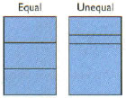 Which of the following rectangles do you think is more interesting, the equally or the unequally divided rectangle?
If you said the unequally divided rectangle is more interesting, you were correct. The rectangle divided into three equal parts (the rectangle on the left) seems logical but it is not very interesting. The unequally divided rectangle (the rectangle on the right) produces contrast and emphasis.
Like you, the Greeks believed that unequal parts were more interesting than equal ones. This can be seen in the way in which they divided rectangular building spaces. People have spent much time and energy trying to devise a foolproof system of proportioning that applies to everything.
The golden section, also called the golden proportion, golden rectangle, or golden mean, is a well-proportioned rectangle designed by the Greeks. The golden section gives safe, pleasing proportional results. It uses ratios like 2:3, 3:5, 5:8, 8:13, 13:21, and so on. Using the golden section can help you achieve designs that have pleasing, informal balance.
The Parthenon in Athens, Greece, is regarded as an especially good example of an aesthetically pleasing building. The Parthenon is a marble temple that was built for the goddess Athena around 440 B.C.

One of the reasons the Parthenon is so pleasing to look at is its proportions, or the way the parts were arranged. The Greeks designed the Parthenon using the proportion 1.0:1.6 and any multiples (notice that if you multiply the proportion by three, the relationship comes very close to 3:5).
How can the golden section be used in design?
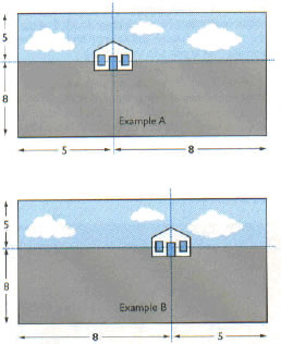
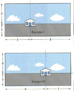
The next four examples show a house placed in four positions, each in a 5:8 ratio to the picture area. The four examples show how the golden-section ratio 5:8 has been used to determine the position of each example’s center of interest—the house.
 Which of the following rectangles do you think is more interesting, the equally or the unequally divided rectangle?
If you said the unequally divided rectangle is more interesting, you were correct. The rectangle divided into three equal parts (the rectangle on the left) seems logical but it is not very interesting. The unequally divided rectangle (the rectangle on the right) produces contrast and emphasis.
Like you, the Greeks believed that unequal parts were more interesting than equal ones. This can be seen in the way in which they divided rectangular building spaces. People have spent much time and energy trying to devise a foolproof system of proportioning that applies to everything.
The golden section, also called the golden proportion, golden rectangle, or golden mean, is a well-proportioned rectangle designed by the Greeks. The golden section gives safe, pleasing proportional results. It uses ratios like 2:3, 3:5, 5:8, 8:13, 13:21, and so on. Using the golden section can help you achieve designs that have pleasing, informal balance.
The Parthenon in Athens, Greece, is regarded as an especially good example of an aesthetically pleasing building. The Parthenon is a marble temple that was built for the goddess Athena around 440 B.C.

One of the reasons the Parthenon is so pleasing to look at is its proportions, or the way the parts were arranged. The Greeks designed the Parthenon using the proportion 1.0:1.6 and any multiples (notice that if you multiply the proportion by three, the relationship comes very close to 3:5).
How can the golden section be used in design?
The next four examples show a house placed in four positions, each in a 5:8 ratio to the picture area. The four examples show how the golden-section ratio 5:8 has been used to determine the position of each example’s center of interest—the house.


In examples A and B, because of the position of the house in the pictures, the ground is emphasized and the most noticeable. The clouds and sky are rather unimportant and the house—the center of interest—seems far away. The foreground emphasizes the distance to the house.
In examples C and D, the position of the house in the pictures emphasizes the sky. The clouds and sky are noticeable and are important. The house—the center of interest —seems not very far away.
Remember, too much or too little of any characteristic gives bad proportions. For example, all rough, all smooth, all simple, all complex, all light, or all dark arrangements results in poor proportion.