Principles of Art
| Site: | Joans-place |
| Course: | Art |
| Book: | Principles of Art |
| Printed by: | Guest user |
| Date: | Friday, 24 October 2025, 4:11 AM |
Description
Basic info
Principles of Art
IntroductionKnowing and following the principles of art will help you with visual sensitivity and creative order, which are both very important in designing. The principles of art enable you, the artist, to see the world much differently than a person who is unaware of them. You will now have the opportunity to learn about the principles of art. You will study seven principles of art, which include the following:
balance - a principle of design that refers to equalization. There are three kinds of balance—symmetrical (formal), asymmetrical (informal), and radial
proportion - the principle of design that deals with the way the parts of a design are arranged in comparison to the whole
movement - the principle of design that refers to the arrangement of parts in a design to create action or motion
contrast /value - the whole range of nuances from light to dark (value) and the difference between light and dark (contrast)
rhythm - the result of repetition. Repetition of lines, shapes, textures, dark and lights, and colors help create relationships among the elements
emphasis- a principle of design used by designers to place importance, prominence, or attention on certain areas or objects. The designer can use opposing sizes, shapes, contrasting colors, or other means to achieve emphasis
unity - can be described as harmony, agreement, concurrence, completeness, oneness. It is what completes and finishes your creative work, giving it a sense of rightness
Hopefully you will enjoy an in depth examination of the principles of art and see how they can be applied to your own works.
Balance
Do you recall when you first learned to dance, skate, surf, or ride a bike? Balance was important in your being able to do these activities, and when you were balanced, you felt comfortable. Do you remember what happened when you lost your balance? You felt panic and immediately tried to get your balance back.Just as you like to remain balanced when riding a bike, artists like to have balance in whatever they create. Art needs good balance.
To understand balance in a drawing, think of children and a parent on a seesaw.
In this image, the apple and pumpkin and the figures are badly balanced. Each of these pictures seem too weighted on the right side.

There are three types of balance. They are as follows:
- symmetrical (formal)
- asymmetrical (informal)
- radial


Asymmetrical objects or shapes cannot be divided into identical halves.
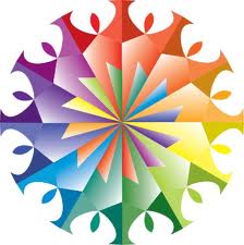
Radial balance radiates from a central point. A good example of radial balance is the wheel of a bicycle. The spokes radiate out to a round rim and tire from a central axle. Radial balance is balance where everything stems from a central point. Examples of radial balance follow.

Proportion
Many artists struggle with proportion to make their designs aesthetic, or pleasing to look at. In ancient times, the Greeks believed they could make buildings that would be in perfect order and aesthetically pleasing by using geometry as part of the design. An aesthetically pleasing design is more visually interesting.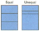 Which of the following rectangles do you think is more interesting, the equally or the unequally divided rectangle?
If you said the unequally divided rectangle is more interesting, you were correct. The rectangle divided into three equal parts (the rectangle on the left) seems logical but it is not very interesting. The unequally divided rectangle (the rectangle on the right) produces contrast and emphasis.
Like you, the Greeks believed that unequal parts were more interesting than equal ones. This can be seen in the way in which they divided rectangular building spaces. People have spent much time and energy trying to devise a foolproof system of proportioning that applies to everything.
The golden section, also called the golden proportion, golden rectangle, or golden mean, is a well-proportioned rectangle designed by the Greeks. The golden section gives safe, pleasing proportional results. It uses ratios like 2:3, 3:5, 5:8, 8:13, 13:21, and so on. Using the golden section can help you achieve designs that have pleasing, informal balance.
The Parthenon in Athens, Greece, is regarded as an especially good example of an aesthetically pleasing building. The Parthenon is a marble temple that was built for the goddess Athena around 440 B.C.
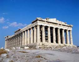
One of the reasons the Parthenon is so pleasing to look at is its proportions, or the way the parts were arranged. The Greeks designed the Parthenon using the proportion 1.0:1.6 and any multiples (notice that if you multiply the proportion by three, the relationship comes very close to 3:5).
How can the golden section be used in design?
The next four examples show a house placed in four positions, each in a 5:8 ratio to the picture area. The four examples show how the golden-section ratio 5:8 has been used to determine the position of each example’s center of interest—the house.
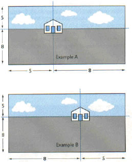
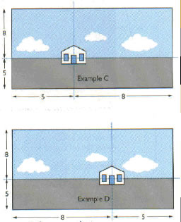
In examples C and D, the position of the house in the pictures emphasizes the sky. The clouds and sky are noticeable and are important. The house—the center of interest —seems not very far away.
Remember, too much or too little of any characteristic gives bad proportions. For example, all rough, all smooth, all simple, all complex, all light, or all dark arrangements results in poor proportion.
Movement
Movement leads the eye to various places in a design. Have you ever watched a conductor with an orchestra?By sweeps of the conductor’s arms, he or she leads various musicians through a music score. Often short, choppy strokes are made, and curved and straight lines are suggested. These arm movements are a language that tell the musicians how certain parts of the music are to be played, how different notes are to be stressed, and so on. The arm movements suggest feelings such as sadness, joy, and excitement.
Movement in design can be suggested by overlapping shapes, like these ones captured by strobe photography.
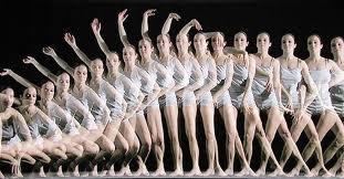
The model was photographed as each new position was taken, and a flow has been created by overlapping the images. This photograph shows how you can give a picture this fluid feeling. (Computer software can be used to create similar effects.)
Artists can make you look at particular things and locations in a picture by working with the elements of art. Sometimes, they want you to look several times at one spot, and your eye keeps going back to this area. The area artists want you to look at might be more detailed, or the color might be lighter or darker, or it might be the spot where the most action is taking place. Limbs and faces can lead your eyes there. Where and how is your attention focused in the pictures that follow?


Feelings of movement can also be achieved with vertical lines to suggest up and down, and with diagonal lines to suggest movement along sloping lines.
Movement can be achieved by using value differences. Shapes can be painted from light to dark, or from dark to light. That will lead the eye in a front-to-back or back-to-front motion.
Complementary colors are useful for creating movement, and so are contrasting cool and warm colors.
Contrast
| light |
dark |
| big |
small |
| calm |
stormy |
| smooth |
rough |
| warm |
cool |
| plain |
patterned |
| straight |
curved |
| bright |
dull |
Following are two examples of contrast. One photograph shows the contrast of a light and dark—a light foreground and a dark background. The other photograph shows the contrast of straight and curved—straight thorns on a curved cactus.


For artists, working with lines, shapes, textures, forms, spaces, patterns, and colors (the elements of art) is exciting. The elements of art can be used to create contrast. A simple way to illustrate contrast is through color. A design using analogous color is lacking in contrast because the colors are too much alike. If you painted a picture and used only yellow orange, orange, and red orange, you would see that everything was very much the same.
A design with complementary colors could show a lot of contrast. A design with green hills and red boats on a lake would have some contrast. A yellow basket with purple flowers could be another possibility.
Contrast can also be shown with different values. For example, light, medium, and dark gray would create a design that shows contrast in values.
Rhythm
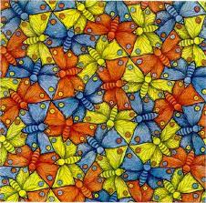
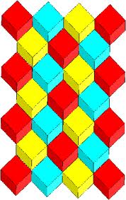
When you repeat any of the elements of art (line, shape, form, space, texture, pattern, colour), you achieve a feeling of rhythm . Rhythm is the principle of art that indicates a type of movement in a design.As you might imagine, there are many types of rhythm in design, just as there are in music. Listen to a movie or radio drama to find out how music is used to create feelings of suspense, excitement, joy, and energy. Some rhythm flows smoothly, while some interrupts and seems rough. Songs have repeated notes that form a pattern. Artists can repeat elements to form a pattern, but with the other senses; for example, with touch, as in sculpture and texture, and with sight, as in line and colour.
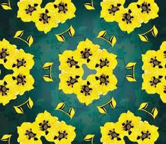
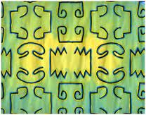
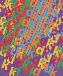
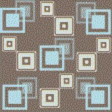
A feeling of rhythm can be created by repetition of shapes and lines. For example, sometimes there are a lot of curved shapes and lines, and these form a pattern. Shapes and lines may be placed close together in one area, and farther apart elsewhere in a design, but they still form a pattern. The repeated patterns create rhythm. In the photographs that follow, rhythm is created by repeating the shapes and lines of the leaves and by repeating the zigzag design elements.
Emphasis
What is the most important aspect in your life? Is what is important to you at this moment the same as it was a year ago? two months ago? yesterday? You know that you change your mind about important aspects in your life. You identify these aspects, sort them, and assign them a set of values. They could gain greater or lesser importance in your life.Similarly to how you emphasize the important aspects in your life, so does an artist. The artist must also identify, sort, evaluate, and decide how to use elements of art to create emphasis. This principle of art is sometimes referred to as dominance.
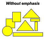
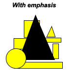
Another way to achieve emphasis is using contrasting colors. More contrast results when using colors that are farthest apart from each other on the color wheel. Complementary colors also provide more contrast. The greater the color contrast, the greater the emphasis.
You can also use space to create emphasis. An area can be emphasized by placing it against an uncluttered background (on open space). A display of shoes in a window might have a simple background, with a lightly patterned scarf, a string of pearls, and some spotlights trained on the shoes. The background must be simple to keep eyes focused on the shoes, the main emphasis of the display.
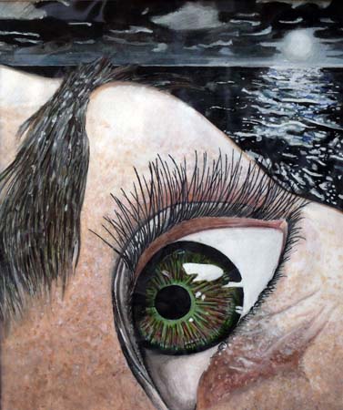
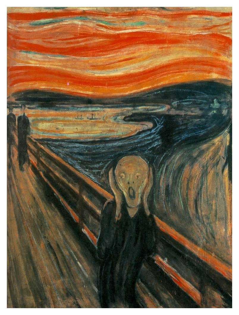
Some examples...



Unity
Unity is the second principle of design you will study. You can see examples of unity all around you. You may have heard the hockey coach or school principal talk about team unity and school spirit. The hockey coach and principal each believe that a better result can be reached if there is unity among the hockey-team members and among the students of the school.Think of the importance of unity involved in a team of sled dogs. If the team of dogs lacked unity, the dogs would be running in many different directions.

To prevent monotony, vary the following:
- lines
- shapes
- forms
- textures
- patterns
- colors
- spaces
Unity within a well composed design accomplishes two things:
-
Unity creates a sense of order. When a design possesses unity there will be a consistency of sizes and shapes, as well as a harmony of color and pattern. One way this is accomplished is by repeating the key elements, balancing them throughout the composition, and then adding a little variety so that the design has its own sense of personality. Learning to juggle the elements and principles in such a way as to achieve the right mix is a key to good design.
-
Unity also gives elements the appearance of completeness, that they belong together. When a composition has unity the design will be viewed as one piece, as a whole, and not as separate elements with the painting. Using too many shapes and forms may cause a design to be unfocused, cluttered and confusing. A well organized design will be achieved by using a basic shape which is then repeated throughout the composition.
For a great discussion of unity visit this site:
http://www.utdallas.edu/~mel024000/pages/unity.html