Principles of Art
Principles of Art
Contrast
Your life is filled with contrasts of all kinds. The human race consists of people who are similar in many ways. People (most people) have hands and feet, feel emotions, walk, and sing. People are also different. They react differently to situations and things around them, and they are different sizes and colors. Such differences add spice and interest to life. How boring it would be if everyone looked and acted alike!
Nature is full of contrasts, both extreme and subtle. Contrasts can fall into many categories. Following are some examples of contrasts:| light |
dark |
| big |
small |
| calm |
stormy |
| smooth |
rough |
| warm |
cool |
| plain |
patterned |
| straight |
curved |
| bright |
dull |
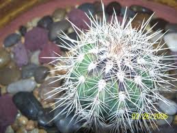
Following are two examples of contrast. One photograph shows the contrast of a light and dark—a light foreground and a dark background. The other photograph shows the contrast of straight and curved—straight thorns on a curved cactus.


For artists, working with lines, shapes, textures, forms, spaces, patterns, and colors (the elements of art) is exciting. The elements of art can be used to create contrast. A simple way to illustrate contrast is through color. A design using analogous color is lacking in contrast because the colors are too much alike. If you painted a picture and used only yellow orange, orange, and red orange, you would see that everything was very much the same.
A design with complementary colors could show a lot of contrast. A design with green hills and red boats on a lake would have some contrast. A yellow basket with purple flowers could be another possibility.
Contrast can also be shown with different values. For example, light, medium, and dark gray would create a design that shows contrast in values.