Foods 2090 Lessons
Plating Salads & Sandwiches
Lesson Question:
Explain how attention to the elements of design may enhance food during preparation and presentation.
Lesson
“You eat first with your eyes”
Plating is the art of presenting food in a way that enhances and improves the appeal of the food itself. It involves many different aspects of food preparation and presentation, starting with the combination of foods that make up the meal, to how the food is cooked, to the plate that is used to serve it, to how it is arranged on that plate, to the garnish decorating the dish. Complicated presentations usually miss the point and distract from the wholesomeness of the food. Simplicity is hard to achieve, but there is beauty in it.
Basic Plating Concepts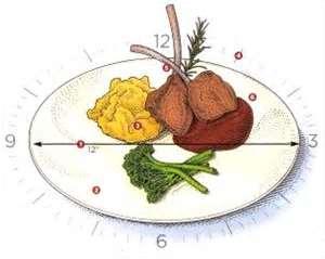
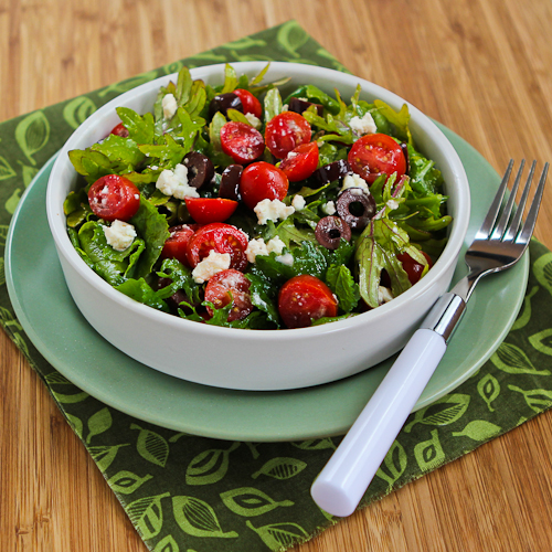
Arrangement: Chefs use white space to strengthen their presentations and so a simple white plate is a good choice. However, this does not mean you can only use white dishes. Sometimes the color of the plate serves to set off the color of the meal. (e.g.: a green salad on a red plate; a juicy burger on a yellow plate; tomato soup in a green bowl, etc.) Make sure your serving plates are big enough to let each food item stand out, but small enough that the portions don’t look tiny. If you're serving a protein, starch, and veggies, arrange the three items according to the face of a clock, with starch at 10, meat around 2, and veggies below 9 and 3. Make sure one of the items acts as a focal point on the plate. Center your food and leave the rest clean; that’s the principle of ”white” or “negative” space. White space allows the elements to exist at all and is key to composition. It reinforces the elements of the presentation.
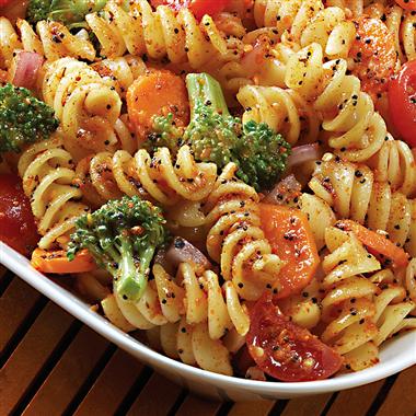
Color: Play with color and texture. Respect natural colors and enhance color by cooking. Small, high contrast elements usually have as much impact as larger, duller elements. Think about color. If you've taken any art courses you may have heard about the color wheel, complementary colors, contrastng colors, and so forth. Concepts such as these can help you with plating.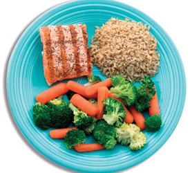
Proportion: A guideline for portion in a meal is vegetables should cover about half of the plate, starch one fourth, and protein one fourth. See the picture at left for an example.
Balance: The rule of odds is used in many art disciplines, in particular painting, photography and advertising. It states that objects displayed in odd numbers seem to bring unity to a composition. The logic behind this rule is that by displaying, three, five, seven, etc… items instead of even numbers, there is always one item that looks framed by the surrounding ones, which looks harmonious. Even numbers tend to bring symmetry in the composition, which appears less natural. Try plating your food with this idea in mind.
Harmony: Striking a harmony between color, texture, shapes and arrangements form the basis of a stylish food presentation. The food presentation ideas are becoming increasingly flamboyant and artistic but it's best to avoid over-garnishing the dishes. Just be creative in presenting the food. Remember, simple is best.
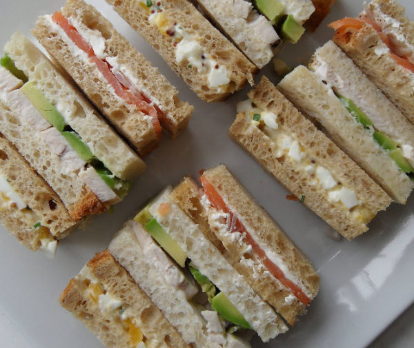
In gneral, most sandwiches are cut in some way before serving.
Cutting serves two purposes:
1. it makes eating and handling the sandwich easier.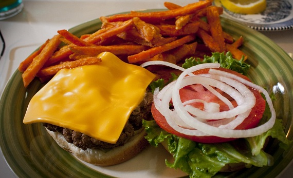
2. it makes for an attractive presentation
Displaying the cut edges to the outside rather than the crust edges is more attractive. If you make the sandwich with great looking ingredients and it is attractively garnished it will be tasty and nice-looking.
